
Common Myths About Dark Paint Colours in Small Rooms

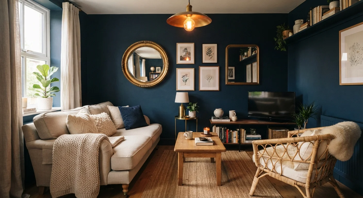
Photo: ArticleHood.com | Precision In Every Word editorial
Key Takeaways
- Dark paint does not automatically make a small room feel smaller - lighting and contrast matter far more.
- A consistent dark colour across walls, trim, and ceiling can actually blur boundaries and make a room feel larger.
- Dark colours work in rooms without natural light when paired with layered artificial lighting.
- Sheen level and paint finish affect how dark colours behave on walls far more than most people realise.
- Colour psychology and how a space is used should guide paint choices, not room size alone.
Why Dark Paint Gets Such a Bad Reputation
Ask almost anyone for decorating advice on a small room, and the answer is usually the same: keep it light. The idea that pale walls are the only safe choice in compact spaces is one of the most persistent beliefs in home décor. But interior designers have long known that darkness, used well, can actually transform a cramped room into something that feels deliberately intimate rather than accidentally tight.
Much of the resistance to dark paint comes from a misapplication of basic colour theory. While it's true that lighter surfaces reflect more light, the connection between wall colour and perceived room size is far more nuanced than a simple light-equals-large formula. Light direction, sheen, furniture scale, and contrast all interact with wall colour in ways that can easily override the raw hue.
The myths below are among the most commonly repeated. Understanding where they go wrong is the first step toward making a confident, informed paint decision for any room in your home. For a broader look at décor decisions that affect how space feels, see our guide to making small rooms feel bigger.
Myth vs. Fact: Dark Paint in Small Spaces
Each of the following pairs addresses a specific belief about dark paint - what most people assume, and what actually holds up under scrutiny.
Myth
Dark paint makes a small room feel smaller and more claustrophobic.
Fact
Dark colours create depth and can blur the boundaries of a room, making the walls feel less defined - not necessarily closer.
When walls are painted in a dark, consistent tone - especially when the colour extends to the ceiling and trim - the room's edges become less visually sharp. Rather than a box with obvious corners, the space reads as a continuous, enveloping environment. Interior designers sometimes call this the "jewel box" effect: the room feels curated and intentional rather than cramped. The sense of claustrophobia is far more likely to come from clutter, low ceilings, and poor lighting than from paint colour alone.
Myth
Dark paint is only suitable for rooms with large windows and plenty of natural light.
Fact
Dark paint can work effectively in rooms with limited natural light, provided artificial lighting is planned thoughtfully.
Natural light does make dark colours easier to live with, but it isn't a prerequisite. Rooms without windows or with north-facing exposures - where natural light is cool and limited - can benefit from a warm, deep paint colour that adds visual warmth the light itself doesn't provide. The key is supplementing with layered artificial lighting: multiple light sources at varying heights create a sense of dimension that a single overhead fixture cannot. A dim room painted white can feel just as gloomy as a dark room with poor lighting.
Myth
You need many coats of dark paint to achieve full coverage, making it expensive and impractical.
Fact
High-quality dark paints typically achieve solid coverage in two coats, particularly when a tinted primer is used first.
Coverage is more a function of paint quality and surface preparation than colour depth. A tinted primer - one colour-matched to your topcoat - significantly reduces the number of finish coats needed, regardless of how dark the final colour is. Applying a tinted primer before a deep charcoal or forest green is standard professional practice. The cost of an additional primer coat is usually offset by needing fewer finish coats, keeping the overall project cost reasonable. For more on common painting misconceptions, see our home improvement myths article.
Myth
Dark walls will make a room feel cold and unwelcoming.
Fact
The temperature a colour conveys depends on its undertone, not its depth - dark warm tones can feel deeply cosy.
A deep navy or cool charcoal can feel crisp and a little austere, while a dark terracotta, forest green, or chocolate brown often reads as warm and enveloping. The undertone - whether a colour leans toward red, yellow, or blue - determines emotional temperature far more than how light or dark it is. Choosing a dark colour with warm undertones for a small living room or bedroom can make the space feel more intimate and welcoming than a pale, cool white would. Understanding undertones before committing is a worthwhile step in any paint selection process.
Myth
Once you paint a small room dark, it's a permanent, hard-to-reverse mistake.
Fact
Dark paint can be covered with the right primer and a suitable number of finish coats - it's no more permanent than any other colour change.
Painting over dark colours does require a stain-blocking or high-hide primer, and you may need an additional topcoat compared with painting over a lighter shade. But this is a manageable, routine part of repainting - not an irreversible commitment. If you paint a room dark and genuinely dislike the result, changing it is a weekend project, not a renovation. Treating paint as a low-stakes, reversible decision makes it far easier to experiment with bolder choices rather than defaulting to safe neutrals out of caution.
Making Dark Paint Work: Practical Considerations
Choosing to go dark is only the beginning. How the colour is applied and how the room is lit will determine whether the result feels rich and atmospheric or simply dim and heavy.
Don't Skip Surface Preparation
Finish matters enormously. A flat or matte finish absorbs light and softens the look of a dark colour, making it feel velvety and grounded. An eggshell or satin finish adds a subtle reflectivity that helps bounce light around the room without looking glossy. High-gloss dark walls can feel dramatic and intentional in the right context - a powder room, for example - but tend to amplify imperfections in wall surfaces, so preparation is critical. If you've struggled with uneven results in the past, our guide on fixing patchy paint covers the prep steps that make the biggest difference.
Lighting is the real variable. Layered lighting - combining overhead fixtures, wall sconces, and table or floor lamps - counteracts the light-absorbing quality of dark walls far more effectively than relying on a single ceiling fixture. Warm-toned bulbs (generally in the 2700K-3000K range) tend to complement dark, warm-hued walls, while cooler bulbs work better alongside grays and blue-greens. Understanding how warm and cool tones interact with light is explored further in our colour palette guide.
Finally, consider what the room is actually used for. A bedroom painted in a deep, moody tone might feel exactly right for winding down at the end of the day. A home office in the same colour might work against alertness and focus. Let the purpose of the space guide you as much as its dimensions.
The content on this site is for informational purposes only and is not a substitute for professional advice. Always consult a qualified professional for guidance specific to your situation.