
Warm Tones vs. Cool Tones: Choosing a Colour Palette for Your Home

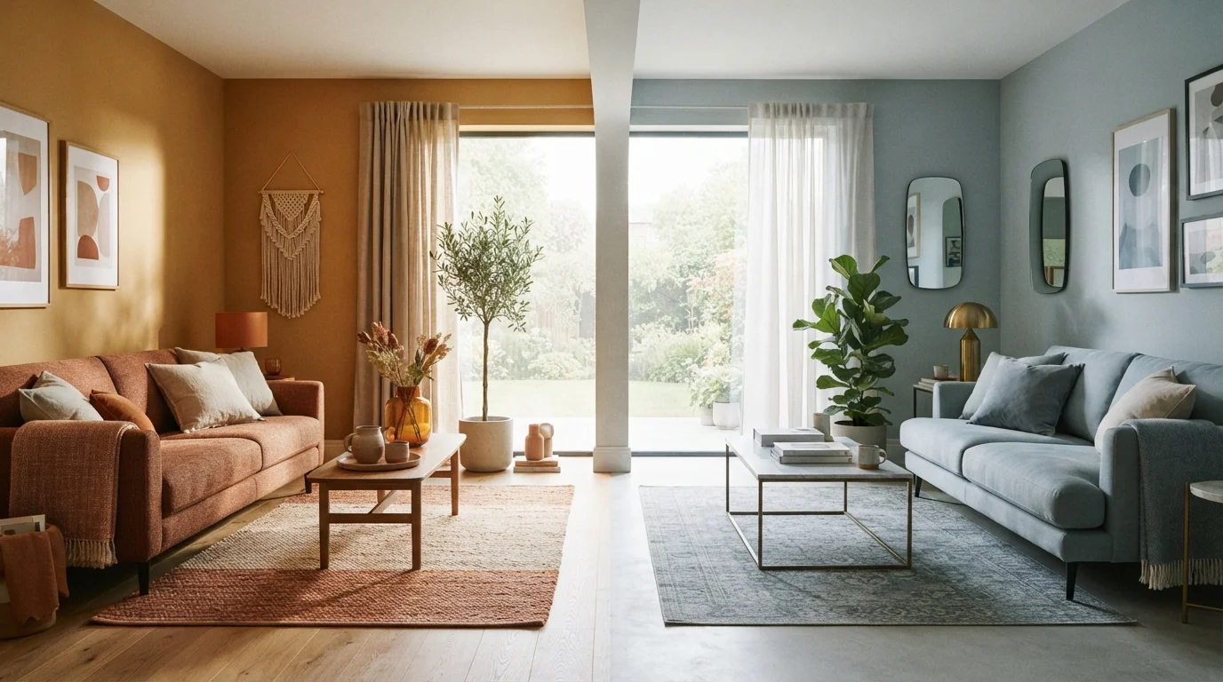
Photo: ArticleHood.com | Precision In Every Word editorial
Key Takeaways
- Warm tones advance visually, making large or draughty rooms feel more intimate and grounded.
- Cool tones recede visually, helping tight or hot rooms feel more open and calm.
- Natural light quality in your room - warm or cool - should guide your palette choice.
- Most successful rooms blend both tone families rather than committing to just one.
- Undertones in whites and neutrals are often more important than the main wall colour.
What Makes a Colour Warm or Cool?
Colour temperature refers to the underlying psychological and visual character of a hue - not its literal warmth. Warm colours sit on the red-yellow-orange side of the colour wheel. They include terracotta, ochre, camel, rust, peach, and most creamy whites. Cool colours live on the blue-green-violet side: slate, sage, dove grey, navy, and crisp white with blue undertones.
The distinction matters because warm hues visually advance - they appear to move toward you, making walls feel closer and spaces feel snugger. Cool hues recede, creating the impression of more distance and air. This isn't just perception: research in environmental psychology consistently supports the idea that colour temperature influences both spatial judgement and mood.
One often-overlooked detail is the undertone in neutrals. A white wall isn't just white - it has either a warm (cream, yellow, pink) or cool (blue, grey, green) undertone. Getting that choice wrong is one of the most common reasons a room feels slightly off despite careful decorating. See our guide on dark paint colours for more on how colour behaves in context.
How Each Palette Affects Light, Mood, and Space
Light is the single biggest variable in any colour decision. A north-facing room receives cool, indirect daylight most of the day. Warm tones counteract that greyish cast, making the room feel more alive and welcoming. A south-facing room flooded with warm sunlight can absorb cooler tones without feeling cold - the natural light does the balancing work.
Mood effects are real but often overstated. Warm rooms tend to feel stimulating and sociable, which suits spaces where people gather and converse. Cool rooms tend to feel quieter and more focused, which suits bedrooms or home offices. That said, intensity and saturation matter as much as temperature - a deep, saturated cool navy reads very differently from a pale icy blue.
Room size and ceiling height also interact with colour temperature. Because warm colours advance, they can make a spacious but sparse room feel more proportional. Cool tones are often recommended for small rooms because they visually push walls back. For a deeper look at how colour and layout work together, our article on making small rooms feel bigger covers practical adjustments beyond paint.
| Warm Tones | Cool Tones | |
|---|---|---|
| Visual effect on space | Makes rooms feel smaller, cosier | Makes rooms feel larger, more open |
| Best room orientation | North- or east-facing rooms | South- or west-facing rooms |
| Mood association | Energising, sociable, grounded | Calm, focused, airy |
| Best suited rooms | Living rooms, dining rooms, kitchens | Bedrooms, bathrooms, home offices |
| Common undertone risk | Can feel orange or pink in bright light | Can feel cold or sterile in dim light |
| Pairs well with | Wood, linen, terracotta, brass | Stone, glass, steel, crisp white |
Blending Warm and Cool for a Balanced Room
Committing entirely to one temperature family is rarely necessary - and often results in rooms that feel monotonous or slightly wrong. Most professionally designed interiors blend both tone families strategically.
A common approach is to anchor a room in one temperature and introduce the other as an accent. A cool-toned living room with slate walls and grey upholstery might be warmed by aged brass hardware, a jute rug, and wood-toned furniture. The warm accents prevent the room from feeling clinical without erasing the spacious calm the cool base provides.
Test Your Palette With the 60-30-10 Rule
Texture also influences how temperature reads. Rough, matte surfaces like linen and raw wood absorb light and read warmer; smooth, reflective surfaces like polished stone and glass read cooler regardless of their literal colour. Our piece on texture in home décor explains how to layer materials for depth. Similarly, layering your lighting can shift a room's perceived temperature dramatically - warm-toned bulbs make cool palettes feel more inviting without changing the paint.
Practical Steps for Choosing Your Palette
Start by observing the light in your room at different times of day. Morning light skews warm and golden; afternoon light shifts to neutral or cool. Note whether the room ever feels too dim, too stark, or too washed out - those are clues about what the palette needs to correct.
Next, pull large paint swatches (at least A4 size) and live with them on the wall for several days before committing. Observe them in daylight, under artificial light in the evening, and next to your existing furniture. What looks warm in the paint store can read purple or green on a north-facing wall.
Finally, think about how the room connects to adjacent spaces. Abrupt palette shifts between open-plan areas can feel jarring. Choosing colours that share an undertone - even if one is warm and one is cool - creates visual flow. Mixing styles coherently applies the same principle to furniture, and the logic transfers well to colour. Your choice of paint finish will also affect how the colour reads once on the wall - a matte finish absorbs light and softens a colour, while a gloss finish intensifies it.
90%
Of snap judgements influenced by colour alone
Studies in consumer and environmental psychology suggest colour accounts for up to 90% of an initial impression of a space or product.
3-4°F
Perceived temperature difference between warm and cool rooms
Research published in environmental psychology literature has found that people in warm-coloured rooms estimate room temperature as notably higher than those in cool-coloured rooms set to the same actual temperature.
The content on this site is for informational purposes only and is not a substitute for professional advice. Always consult a qualified professional for guidance specific to your situation.