
Texture in Home Décor: The Element Most People Overlook

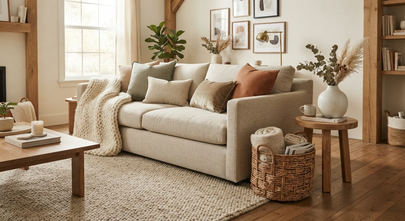
Photo: ArticleHood.com | Precision In Every Word editorial
Key Takeaways
- Texture adds depth and warmth to a room without changing paint colour or furniture layout.
- Mixing three to five different textures prevents a room from feeling flat or overly matched.
- Both tactile and visual texture contribute to how a room feels - not just how it looks.
- Natural materials like linen, jute, wood, and stone are reliable sources of organic texture.
- Layering textures at different heights - floors, furniture, walls - creates a more complete effect.
Why Texture Gets Overlooked
Most people decorating a room focus first on colour, then furniture, then layout. Texture rarely makes the shortlist - yet it's often the missing ingredient in spaces that feel somehow incomplete even after careful planning.
The reason texture gets skipped is partly because it's harder to visualise in advance. Paint colours come with swatches; furniture arrives in photos. Texture, by contrast, reveals itself in person - in the way a nubby cushion catches afternoon light, or how a smooth plaster wall reads differently from a matte-painted one. Because it's experiential, it tends to be an afterthought rather than an intention.
That's a missed opportunity. Texture is what makes a room feel inhabited rather than staged. It signals that real life happens there - that the space is warm, layered, and considered. Scale and proportion get a lot of attention in design conversations, but texture often does as much quiet work.
Texture Works Across Every Budget
How Texture Actually Works in a Room
Texture functions on two levels simultaneously. The first is tactile - the physical sensation of touching a surface. A chunky wool throw, a rough-hewn wooden shelf, a smooth ceramic lamp base: these invite touch and communicate warmth or coolness, softness or solidity.
The second level is visual. Even materials you never physically handle - a shiplap wall, a grasscloth-effect wallpaper, a brushed-metal pendant shade - register as texture because of how light moves across them. Surfaces that catch and scatter light feel more dynamic than flat, uniform ones.
This is why texture and lighting are so closely connected. The same woven rug can look completely different under a warm overhead fixture versus near a bright window. When you're evaluating how texture reads in a room, try to observe it under the same lighting conditions you'll actually live with.
3-5
Distinct textures recommended per room
Interior design practitioners commonly suggest this range as sufficient for visual richness without sensory overload.
~60%
Of a room's texture typically comes from textiles
Rugs, curtains, upholstery, and cushions collectively account for the majority of tactile surface variation in most furnished spaces.
Building Texture Into a Room: A Practical Approach
The most reliable method is to layer texture across multiple surfaces at different heights - floors, furniture, and walls - rather than concentrating it in one area.
- Floor level: Rugs are the single most impactful source of texture in most rooms. A flat-weave cotton rug reads very differently from a high-pile wool or a natural jute. If you're deciding on placement, how you sequence rugs and furniture affects the overall result.
- Furniture and upholstery: Mixing seating materials - say, a linen sofa with a leather accent chair or a velvet cushion - adds texture without requiring an entirely new colour palette.
- Walls and ceilings: Paint finish matters more than most people realise. A matte finish absorbs light and feels soft; a satin or eggshell finish reflects it slightly and feels more polished. Comparing paint finishes is a practical step many decorators skip.
- Accessories and accents: Ceramics, books, woven baskets, and plants all contribute surface variety. Organic forms - irregular shapes, natural grain, visible weave - are particularly effective because they introduce the kind of imperfection that reads as warmth.
Try the 'Three-Texture Rule' as a Starting Point
Common Mistakes and How to Avoid Them
The most frequent mistake is using too many textures of the same weight - for example, filling a room with heavy, coarse materials (chunky knits, rough wood, raw brick) with nothing smooth or refined to offset them. The result tends to feel oppressive rather than cosy.
The solution is contrast. Smooth surfaces make rough ones feel more intentional, and vice versa. A polished stone tray sitting on a rough wooden sideboard creates a small moment of tension that the eye finds interesting.
A second mistake is treating texture as a finishing flourish - something added after the real decisions are made. Ideally, texture is considered alongside colour palette and furniture selection, since some combinations work better together than others. A monochrome or neutral palette, for instance, relies heavily on textural variety to stay visually engaging.
Finally, don't overlook plants as a texture source. Foliage introduces organic, irregular surface quality that manufactured objects rarely replicate - a genuinely useful design tool, not just a lifestyle trend.
Frequently Asked Questions
The content on this site is for informational purposes only and is not a substitute for professional advice. Always consult a qualified professional for guidance specific to your situation.